Images used for online display
As you know, stocks and bonds are highly diverse, both between companies and within individual companies. While small and unsuccessful companies may have issued only one design, it was not uncommon for major companies to have issued fifty or more designs, and designs may have changed frequently. Some design changes were very minor, but are nonetheless reported by collectors who frequently report minor alterations. Some minor changes have gone unnoticed twenty years and more without discovery. Therefore, I have found it tremendously important to collect and maintain vast numbers of images of those various designs.
Types of images saved
There is much overlap between the three main types of images saved for this project.
- images of serial numbered certificates. Image quality ranges from poor to excellent. These are collected from contributors, dealers, and auction sites. Images may have originated as scans or photographs, Certificates may appear rectangular or highly distorted. Usually only the best image of each serial number is maintained. Images of very low quality are gradually improved as collectors buy those certificates and contribute images for these project.
- Images of specific varieties displayed on this web site. Display images are saved in two sizes: 1) thumbnail images at 200 pixels wide, and 2) illustration images at 640 pixels wide. Images of varieties are also gradually improved over time when collectors send better images of certificates in their collections. Images of this category tend to originate as scans, although the number of collectors who own scanners has been dropping as the quality of smartphone cameras has increased. Unfortunately, all photographs of certificates show some distortion and uneven lighting. When needed for display, photographs are manipulated to return certificates to rectangular shapes and to correct exposure and color.
- High-resolution images. Behind the scenes, I maintain even better images sent by collectors when those images have resolutions of 300 dpi or better. Practically all images that classify as "high- res" originate as scans. I can occasionally manipulate high-resolution photographs sufficiently to save them as high-resolution images when all parts of certificates are in proper focus. As a general rule, it is easy to read names of printers and engraving in high-res images. When collectors send high-resolution images, copies are commonly made at 200-px and 640-px sizes and used for variety displays.
Image priorities for online display
Ideally, I would like to display one high-resolution image for every variety of certificate known. Of course, that is utterly impossible at this time, and possibly impossible, period. After all:
- Not every collector of railroad certificates knows about this project.
- Not every collector has the ability to scan or photograph certificates at sufficient quality.
- Not every collector wants to contribute to this project.
- Not every collector has the ability to view high-resolution images.
- Not every collector has the band-width required to download high-resolution images.
- The cost of hosting and delivering high-resolution images is not economic for a non-commercial project like this.
What I can do, however, is display as many certificates as possible at lower resolution. Even then, I insist on certain non-negotiable display priorities:
- Images must be sufficiently large to display key details. (640 pixels wide is usually sufficient.)
- Display colors must be reasonably close to actual.
- Certificates must look rectangular.
- Certificates must be oriented properly.
Below the level of those priorities are preferences. For instance, I prefer to illustrate certificates typical of the ones most likely to be encountered by collectors of some experience. While beginners tend to discover the hobby through the purchase of unissued certificates, I do not want to over-emphasize that part of the hobby with the lowest values. Similarly, I do not want to imply the necessity of collecting at the most expensive levels or most exotic niches.
I receive images from collectors ot all levels of experience within the scripophily hobby. All use different methods and different equipment to image their certificates. In order to display those as as similarly as possible, I "touch" every image in some manner. When newly-received images are noticeably better than ones currently used online, I replace old with new. However, as a general rule, if images are very similar in quality, I prefer to keep older images in order to honor those earlier contributors. Having said that, I genuinely appreciate every contribution, even if images add nothing more than a missing serial number or date,
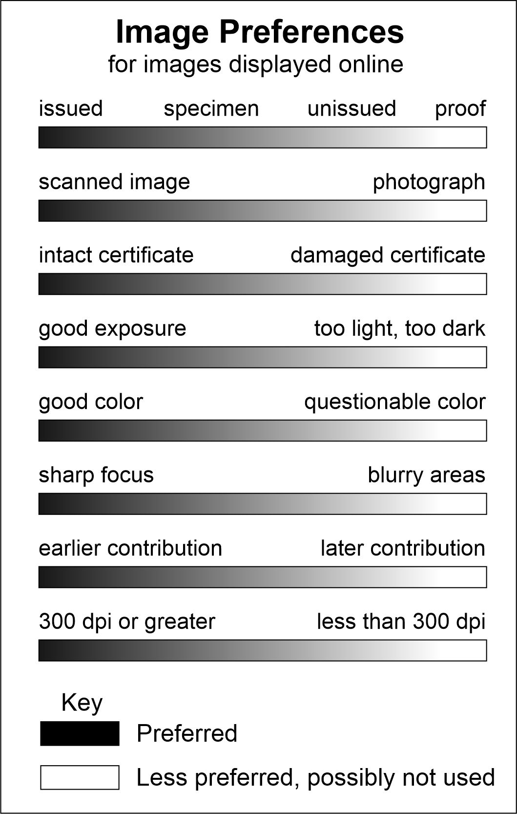
Occasionally, contributors send images that are somewhat better than predecessors, but I ultimately choose to keep older images online for reasons other than quality. In other words, there are lots of judgement calls that are not necessarily obvious. There may be a less obvious preference to use one image over another and that preference lies on some sort of spectrum. At right is an illustration of the various factors that influence my decisions about which images to use and which images to simply store for future comparisons.