
Sharpening
Sharpening is nowhere near as simple as it sounds
The whole idea of sharpening is simple. Do something to images to make features look more crisp, more readable and less fuzzy. That is an understandable goal but creates a few questions in response. What do you want to sharpen? Is sharpening necessary? How much will images allow you to sharpen? How much effort will it take? What precisely do you want to gain?
All but the most rudimentary photo editing programs have answered those challenges and have built in routines to sharpen images. Obviously, the basic idea is to make images, or at least parts of images, appear more distinct. Let's face it – no casual user wants to spend more than a minute, let along ten, trying to make that happen.
Eyes are usually the first things humans look at in photographs. Areas around eyes are commonly sharpened slightly in people photographs seen im upscale magazines. If a pro did it, you'll never notice sharpening at all.
Most initial attention is drawn to engraved vignettes on certificates. If someone wanted to make certificates more attractive, that is what they would focus attention on first. However, for all its Inviting seduction, sharpening is an advanced technique and takes effort and sensitivity to master. I suggest that sharpening vignettes is probably best left alone until serious needs arise. If you want to scan certificates and save them without a lot of fussing, scan them at 300 dpi, straighten them, crop them and then leave them alone. There is no need for sharpening until specific purposes arise that require the investment of time to achieve the level of improvement sharpening can provide.
Conversely, I heartily advise experimenting with sharpening to understand what is happening. Push sharpening to its limit and see what over-sharpened images look like. Experimentation and failure is the only time-approved way to really learn software.
Why do you want to sharpen?
I think the first impulse is to start clicking when users see the "sharpen" button in photo editing software. It is natural to think, "If a little is good, more is better." The problem is that sharpening rarely helps whole images. In many cases, it is probably better to sharpen only those parts of images that need improvement or that need to be emphasized. Other than experimenting, I thoroughly advise using sharpening sparingly until you study the process and ramifications in greater detail. When it comes to sharpening, "less" is usually more.
Before you really attack the sharpen button, try to figure out
- What is the intended use? Printing? Screen display? Archiving images for future use? Publication?
- What part of certificates need enhancement? Vignettes? Autographs? Dates?
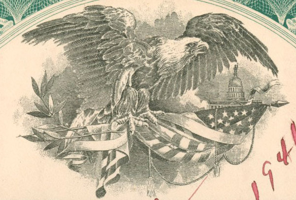
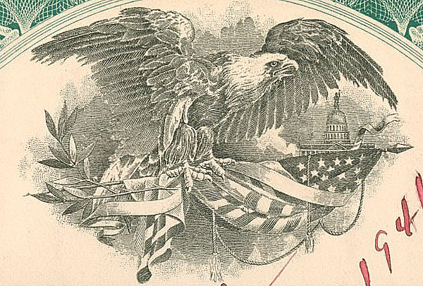
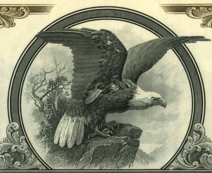
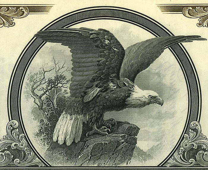
Most vignettes printed before 1900 were created by engraving and etching either into soft steel or lithograph stones. Sharpening CAN help both types of vignettes, although steel plate vignettes with very fine, closely-packed lines can turn into sparkly black blobs very quickly if over-sharpened. The two sets of examples below show equal amounts of sharpening.
PLEASE NOTE: Image sharpening, including the examples below, will be most pronounced on desktop monitors, less noticeable on tablets and probably invisible on smartphones.
| Original |
Sharpened |
|
|
The above vignette was probably printed from a lithograph stone. Moderate sharpening makes the Capitol building and the feathers in the eagle more visible, The stars and the stripes in the flag are also improved a bit. Close examination shows the image was slightly over-sharpened, but it serves its purpose here on the web.
| Original |
Sharpened |
|
|
Sharpening the engraved eagle above brings out lines in the rock. The floral designs in the corners end up with less detail, but are more distinct. Parts of the tree behind the eagle are a little "sparkly", suggesting a bit too much sharpening. Also look at the frame surrounding the vignette. The appearance of weird "interference lines" is called a "moiré pattern," and commonly occurs when screen or print resolution is insufficient to display separate lines. If actually needing to sharpen this engraved image, it would have been better to use sharpening on the eagle and rock while leaving the tree and frame alone. The ornaments in the bottom corners might be okay depending on ultimate use.
Over-sharpening is worse than under-sharpening
If interested in learning about and experimenting with sharpening, please download my tutorials addressing sharpening certificates:
| Original |
Sharpened |
|
|
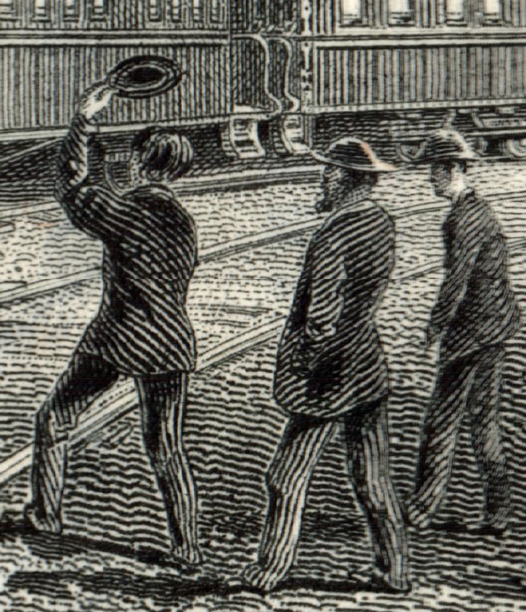
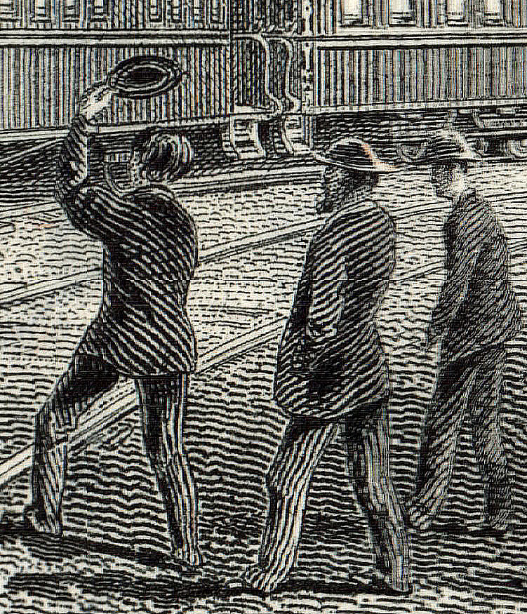
This is part of an engraved vignette shown at bottom, The three men were highly enlarged to see linework better. The example of the right is not terrible but is definitely over-sharped. The vertical lines on the passenger cars are brighter, but the more delicate shading in between the cars has been lost. The prominent engraved lines on the men's coats has been emphasized, but again, the more nuanced shading almost gone. The mans' jacket at the right is just weird. The dirt between the tracks in the mid-distance is much brighter, but the dirt in the foreground is overly-striped, bordering on obnoxious.
| Original |
Sharpened |
Over-Sharpened |
|
|
|
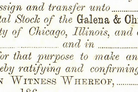
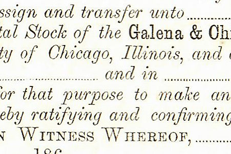
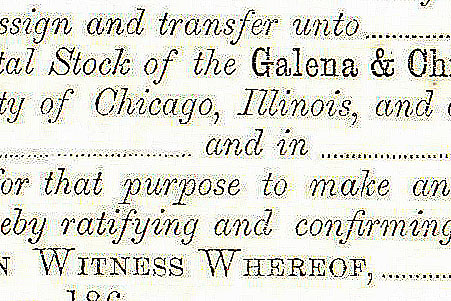
Over-sharpening becomes very noticeable in text. The typeset text in the example above about is 9 point text from a Galena & Chicago Union Rail Road Company certificate. These examples are enlargements of the sharpened text. Note that the letters in the middle example are more readable. It is common that text on engraved certificates can be enhanced with just a small amount of sharpening. Note that the text in the rightmost example has yellowish halos around the words. In areas where ascenders and descenders approach each other (e.g. the words "purpose" and "ratifying"), small fuzzy dots ("artifacts") negatively affect readability. At this level, the sharpening routine is detecting uneven areas of color in the paper and is trying to enhance edges that don't exist.
(To see even better on desktop or laptop computers, hold down the Ctrl key and tap the plus sign ("+") several times to enlarge even more. To go backwards, hold down the Ctrl button and tap the minus ("-") sign the same number of times. On Macs, hold down Option and Command and tap Equals ("=") or Option + Command + Minus ("-").
When to apply sharpening?
The appropriate time to apply sharpening is when you have your image at the final resolution you want to use. I scanned the vignette below at 1200 dpi, making the image 6,672 pixels wide coming out of the scanner. I wanted the image to appear about 500 pixels wide when this page is displayed on a monitor at least 15 inches wide. I reduced the image to 500 pixels wide and then applied a light amount of sharpening, resulting in the image you currently see.
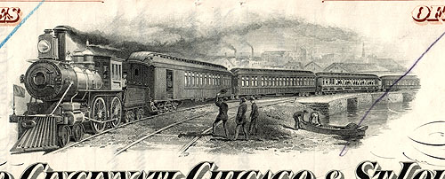
This image is a very small file and yet acceptably close to the original certificate. Held at arm's length, the scan is very similar in appearance to the certificate with one exception; the sharpening actually made the three men in the center stand out more than they should, but more like blobs than people. I used Photoshop to make the sharpened image. Results through other applications might be better or worse.
The one thing I don't like about the image above is the slight yellowing imparted during scanning . I have found this to be the rule, not the exception, in a large percentage of the scanned images I see on the web. If you experience the same thing as our Hewlett Packard M477 Color Laser Jet Pro printer/scanner, then see my page that discusses removing yellow from scanned images.