Colors used on certificates
When were colors first used on railroad certificates?

Image courtesy of Mario Boone
If we look at railroad certificates created after the 1880s, we notice that the majority were printed with black text and colored borders. Not all, of course, but certainly certificates that were printed by the intaglio method using engraved plates. Many generically-printed stock certificates were printed by lithographic methods, but many of those also show colored borders or underprints.
Up until about 1860, or roughly the start of the American Civil War, the vast majority all railroad stocks and bonds were printed with one color - black. Nonetheless, a few certificates printed in red or blue survive from the earliest days of security printing in North America.
The certificate shown above from the Harrisburg Portsmouth Mount Joy & Lancaster Rail Road Company, is dated 1837 and is one of the earliest stock certificates printed in color.
The gradual shift toward two-color printing
The first experiments in two color printing seems to have taken place around 1850 when colors were added as underprint designs, mostly on bonds. In those cases, bond denominations were printed in red or blue, approximately in the center of certificates. The denominations were not intended to overwhelm the important text, so were printed first. After the ink dried, the certificates were printed a second time in black to add borders, text, denomination medallions, and signature lines. A third plate was often needed to print additional text on the backs of certificates.
Even the earliest uses of colors were not meant as merely eye-catching decorations. Instead, they served to add a level of prevention against counterfeiting, both through the necessity of creating additional printing plates, but also in color matching and positioning on finished certificates.
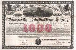
At right is one of the earliest uses of a colored bond underprint, prepared by Hatch Lithographic Company for the Southern Minnesota Rail Road Company in 1850.
Early moves beyond underprints
 Image courtesy Heiko Graffstadt
It is almost a certainty that other uses of colors had been imagined long before 1850, but execution had proven challenging because of both the extra work and the need for proper registration of color and black on finished certificates. After all, most of the certificate printing at that time was accomplished with either thick and irregularly-shaped lithographic stones or movable-type letterpress. Consequently, colors posed challenges not just for counterfeiters, but for professional companies, too.
It seems to have taken a few years for the usage of color to progress beyond the denomination underprint phase.
Although exact registration remained a problem, registration on letterpress was easier than with lithographic stones. One such example from 1854 appears at right. It shows a stock certificate ffor the Peach Orchard Coal Company printed by C. Clark & Company at the Ben Franklin Printing House in Cincinnati. The company name, certificate type, par value, and medallions were printed in red and the rest of the text was printed in black. Registration was nearly perfect.
Expanding the use of color
 Image courtesy of Matthias Schmitt
The ability to accurately register impressions between inkings increased fairly quickly. Still, modern technology and today's imaging allows us to spot small registration problems all the way up to the last major uses of paper securities in the 1980s.
The bond shown at right is one of the earliest appearances of engraved colored borders combined with denomination medallions using large metal printing plates. This example shows a text-heavy $1,000 bond of the Transit Rail Road Company. This bond was printed by American Bank Note Company in 1858 from Bald Cousland & Co. vignettes and borders, only a short time after the ABNCo association was formed. By examining the bottom corners, one can see that the lathework borders were pieced together as opposed to being machined as a single, continuous frame common to later certificates.
Early multi-color experiments
 Image courtesy of Franky Leeuwerck
I cannot possibly say when the first attempt might have been made at printing railroad certificates in multiple colors. This 1857 example is the earliest in the railroad database, and printed a year before the previous example. The bond of the East Tennessee & Virginia Railroad Company is incredibly rare as is the printing effort that went into its production.
It appears that the front printing required five separate plates: red, green, blue, brown, and black! The small type size and tight engraving of the vignettes makes me think the plates were metal, probably copper. I remember a couple other later certificates printed in three colors plus black, but no other five-plate efforts.
Moving to the "modern" standard with wide. colored lathework borders

Terry Cox image
It appears that the first certificates printed in what became a modern standard — black text, wide colored lathework borders, and impressive engraved vignettes — appeared in about 1866. Among them are gold bonds from the Boston Hartford & Erie Rail Road produced by National Bank Note Company. 20,000(!) of those bonds were issued, so they are easily obtainable.

Image courtesy of Sam Withers
That same year, the Continental Bank Note Co. pioneered its own version of inventive lathework borders designed to thwart counterfeiters more than ever before. Here is an example from the St Croix & Lake Superior Railroad Company.
Machine engraving

Borders like those shown above were created by large, heavy machines called "geometric lathes." I describe them using the word "lathework" because it rolls easily off the tongue. The proper term for them is actually "machine engraving." Similar designs can be created with a toy called the "Spirograph," first released in 1965 and recently re-introduced.
Andrew Hurle explained the process of machine engraving in detail is his excellent article titled "Abstractions of Value" which appeared in the September, 2014 issue of the Numismatist, The article is reproduced in its entirety on the American Numismatic Association website at https://blog.money.org/coin-collecting/abstractions-of-value.
Lathework borders, wide or narrow, could be imitated by counterfeiters, but were impossible to reproduce exactly. The wider the border or lathework design, the more visually distinctive it can be made. The example at right is a corner from a Pennsylvania Railroad stock certificate. Can you imagine a counterfeiter attempting to duplicate even this small sample?
Where is ABNCo in these illustrations?
Experienced collectors might wonder, "Why isn't American Bank Note Company better represented in these early certificates?"
Seven major engraving and printing companies formed an association in April, 1858 known as American Bank Note Company. For the next decade and a half, it focused heavily on its principal business bank note printing bank note. It had very lucrative contracts with the United States and state bank printing currency, While ABNCo did print some securities at the time, it did not need to divert its attention away from the bank note business. The only railroad certificates currently known to have been printed by American Bank Note Company between 1858 and 1868 were unicolor black certificates plus a few with colored underprints.

Terry Cox image
As the Federal government gradually took over currency printing, ABNCo ventured increasingly into printing securities. Its first really serious attempts appeared in 1869, with black text, highly-skilled vignettes, and wider lathework borders. Among those that appeared that year were State of Arkansas aid bonds, the Alabama & Chattanooga Rail Road, and another popular favorite, The Blue Ridge Railroad Company. After initially ignoring the securities business for many years, ABNCo rose to became the single largest supplier of security certificates to all major industries, including railroads.
(Please note that none of the certificates mentioned above are necessarily the earliest railroad securities in their category; they are merely the earliest ones I can confirm from my database at this time. Note also that Archives International Auctions purchased huge numbers of specimen bonds from American Bank Note Company archives in 2002. Since liquidating many incredible, long-lost specimen bonds through its auctions, there is a statistical bias toward ABNCo bonds over ABNCo stock certificates. I have been told that large numbers of ABNCo stock certificate specimens exist, but the owner of those certificates has never attempted to liquidate large numbers. For that reason, I expect the reporting of long extinct ABNCo specimen stock certificates to increase over time.)
Does color relate to any other quality of railroad certificates?
This is a question I've toyed with several times. I am not saying colors are completely independent of other relationships, but none have proven to be statistically important. It once appeared that green and brown colors were weakly related to $1,000 bonds, but that imagined association fell apart once when it became clear that 35% of all stocks and bonds were printed in some variation of green or brown.
Common and preferred stocks are both sub-groups of "capital" stock. Generally speaking, if a company issued both common and preferred stock, shares of common stock substantially outnumbered preferred shares. Preferred stocks were given preferential treatment relative to dividends, so preferred certificates were often printed in different colors than common stocks. While the association is extremely weak, 8% of preferred stocks were printed with some shade of red versus 6% of common stocks. Like I said, there might be some relationship between color and some other feature, but it is minimal.
The relationship between color and American Bank Note Company
As mentioned above, American Bank Note Company did not exist until 1858. Based on existing certificates including specimens, ABNCo did not start producing railroad securities in any substantive way for ten years. HOWEVER, from that point forward, ABNCo became the driving force in security printing, singlehandedly accounting for OVER ONE-THIRD of all varieties of railroad certificates printed.
No other company came close to ABNCo in pioneering security measures. It was the leader in intaglio printing of ultra-high quality vignettes and lathework borders. It developed "planchette paper" with tiny imbedded paper disks that fluoresced under ultraviolet light. It engraved corporate seals and underprints that had 3D appearances when printed. (I call that kind of engraving faux relief.) Late in its existence, it developed an obscure security measure called "intaglio latent image" that can only be detected when certificates were viewed obliquely against strong light.
(Note: Intaglio latent image printing can be seen on only a tiny handful of railroad certificates. It was invented at about the same time that electronic trading began replacing paper certificates. Moreover, I have not yet found a way to photograph the effect.)
ABNCo also developed its own inks and unique colors that are almost impossible to describe, let alone duplicate. Although ABNCo's earliest certificates were printed in unicolor black like its seven predecessor companies had done, the company quickly abandoned black-only printing for almost everything except ordinary receipts and peripheral documents. Even with a decade of delay, a count shows that ABNCo printed 85% of all rail-related stocks and bonds with colored borders. In order to compete, competitors began printing more of their products with colored borders, but none to the extent of American Bank Note Co.
Archives International's purchase and slow liquidation of ABNCo bonds allows us to know more about bonds than stock certificates. While 85% of all known varieties of ABNCo stocks and bonds were printed with colored borders, we must surmise that stocks are significantly undercounted. If we look only at bonds, we see that ABNCo printed 91% of its output with colored borders compared to only 61% by all other printers. No matter how we look at the overall picture, ABNCo was the hands-down leader in color printing.
Let's not forget Homer Lee Bank Note Company

Image courtesy of Dr. Thomas O'Shaughnessy
None of this is to imply ABNCo was without notable competitors. One engraver/printer, familiar to advanced collectors, was Homer Lee who produced certificates as early as 1871. His finesse quickly evolved into the Homer Lee Bank Note Company in 1873. HLBNCo bonds are especially notable because many were executed in what I call "High Victorian" style.
Because of variable line densities in HLBNCo engravings, many of its colored certificates, especially bonds display wonderful light-to-dark variations. The 1888 $500 bond of the Winona & SouthWestern Railway Co. example at right is one such example. I consider this a quintessential example of classic Homer Lee style. I doubt any counterfeiter, even the best, would ever have considered faking a certificate like this!
ABNCo acquired Homer Lee Bank Note Company in 1891, but during its period of independence, Homer Lee and HLBNCo produced 355 bonds and 128 stock certificates listed in this database. Of that number, 96% were produced with colored lathework and engraved borders.
Security ramifications of border and underprint colors
Obviously, colors make certificates more attractive, so there was always a certain degree of promotional value to colors, custom-engraved company names, and life-like vignettes. Colors, however, helped thwart counterfeiters by adding a serious extra layer of difficulty. Moreover, colors made it terribly hard to "raise" denominations on certificates (like raising a <100-share certificate to 100 shares or raising a $100 bond to $1,000.) Think about how easy it would be to spot a counterfeit certificate printed with odd colors.
Identifying varieties by colors
Colors are crucial to determining how existing certificates fit in with varieties already described. They are especially useful in spotting new varieties. However, I need to be clear about how colors are described in this project.
As a general rule, I try to describe certificates with primary colors plus a few well-accepted combination colors. If a certificate displays a colored border close to the accepted definition of "purple," that is how I describe it in the database. I purposely avoid parsing color descriptions like catalogers do in some other hobbies. Although some collectors might prefer terms such as lavender, pale purple, deep purple, violet, deep violet, pale violet, or countless variants of "purple" found in hardware store paint aisles, I aim for the midpoint. That is the description most collectors are going to know and will generally agree with.
If I describe a certificate as "purple" and a collector owns a certificate that is clearly "brown," then there is a good possibility of adding a new variety to the database.
Conversely, if a collector spots a brown variant on eBay or elsewhere on the web, I will not automatically create a new variety. We will need verification because scanners, cameras, and smart phones do not necessarily reproduce colors correctly in uncontrolled lighting situations. There are too many variables such as the color spectrum of ambient light, the age of scanner bulbs, and the lack of calibration in all those devices. Additional, every uncalibrated monitor adds its own bias to the color spectrum. The colors my correspondents see on their devices are not necessarily what I see on mine.

Image courtesy of Damon Pritchett
The image of the certificate shown at right is adequately close to the real color of the Atchison Topeka & Santa Fe Railway Co bond. I call it "purple," which is really a combination of blue and red inks. Adding a bit more or a bit less of either color, no matter the source, changes its appearance.
If that certificate had been photographed under an incandescent bulb, the color of light would have been much more yellow and the purple color would have become closer to a brown. A similar thing happens with scanner bulbs that tend to migrate away from an acceptably pure white as they age.
The point of this discussion is to warn collectors to never trust the color of certificates you see on the web, no matter their origin. Moreover, you should never trust my color descriptions either. After all, many of my descriptions come predominately from digital images.
I use a calibrated, high-quality 11x17 desktop scanner and even it does not reproduce the colors of all certificates to my satisfaction. My assessment probably has more to do with my monitors than my scanner, because my monitors can be calibrated by eye, but not against a formal standard. If you disagree with any of my descriptions, correct me and send an image that adequately reproduces the color of your certificate. I am not "married" to any color description.